Voyager Estate

Label design. Brand development.

Photography: Simon Westlake

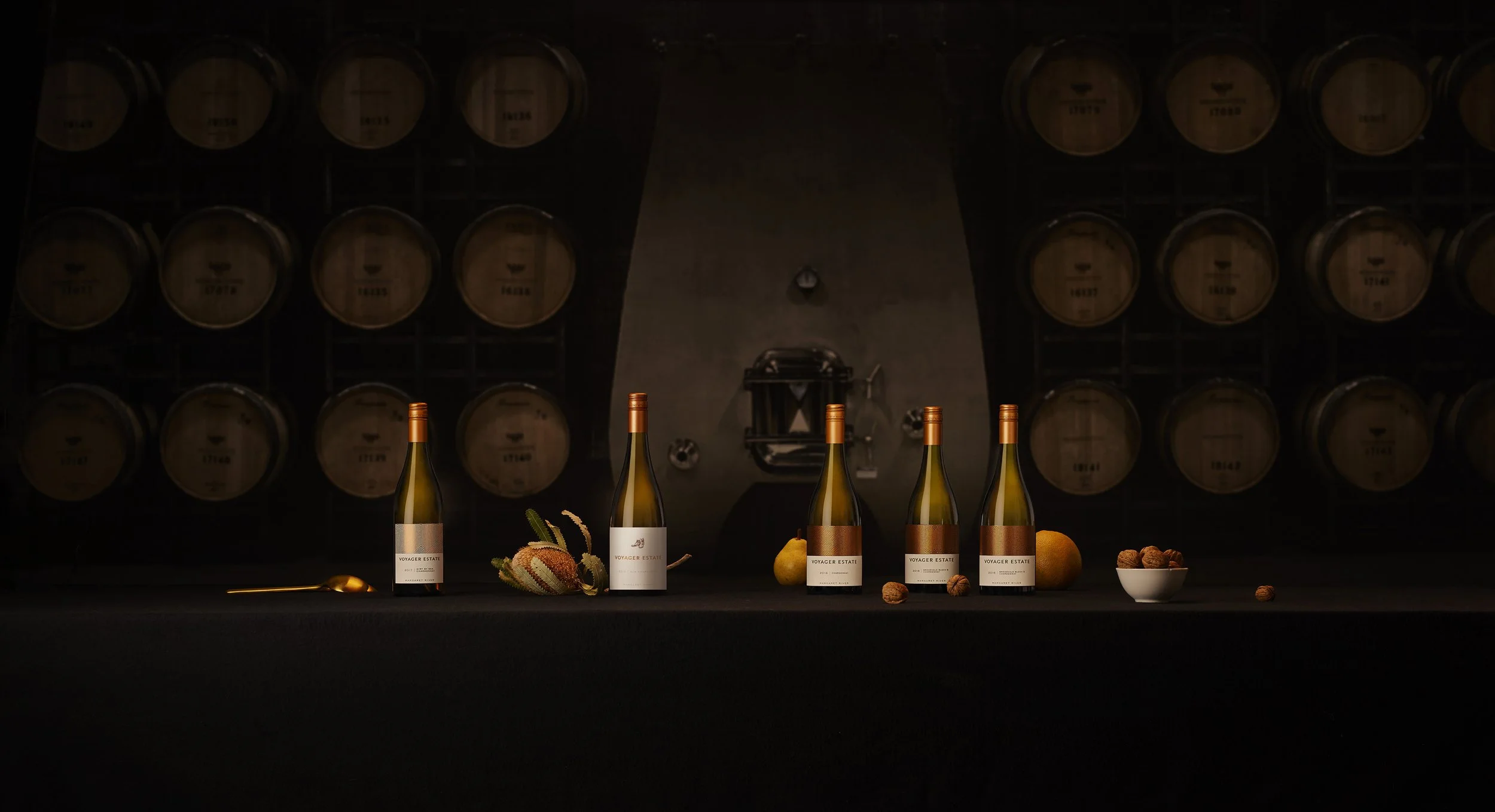
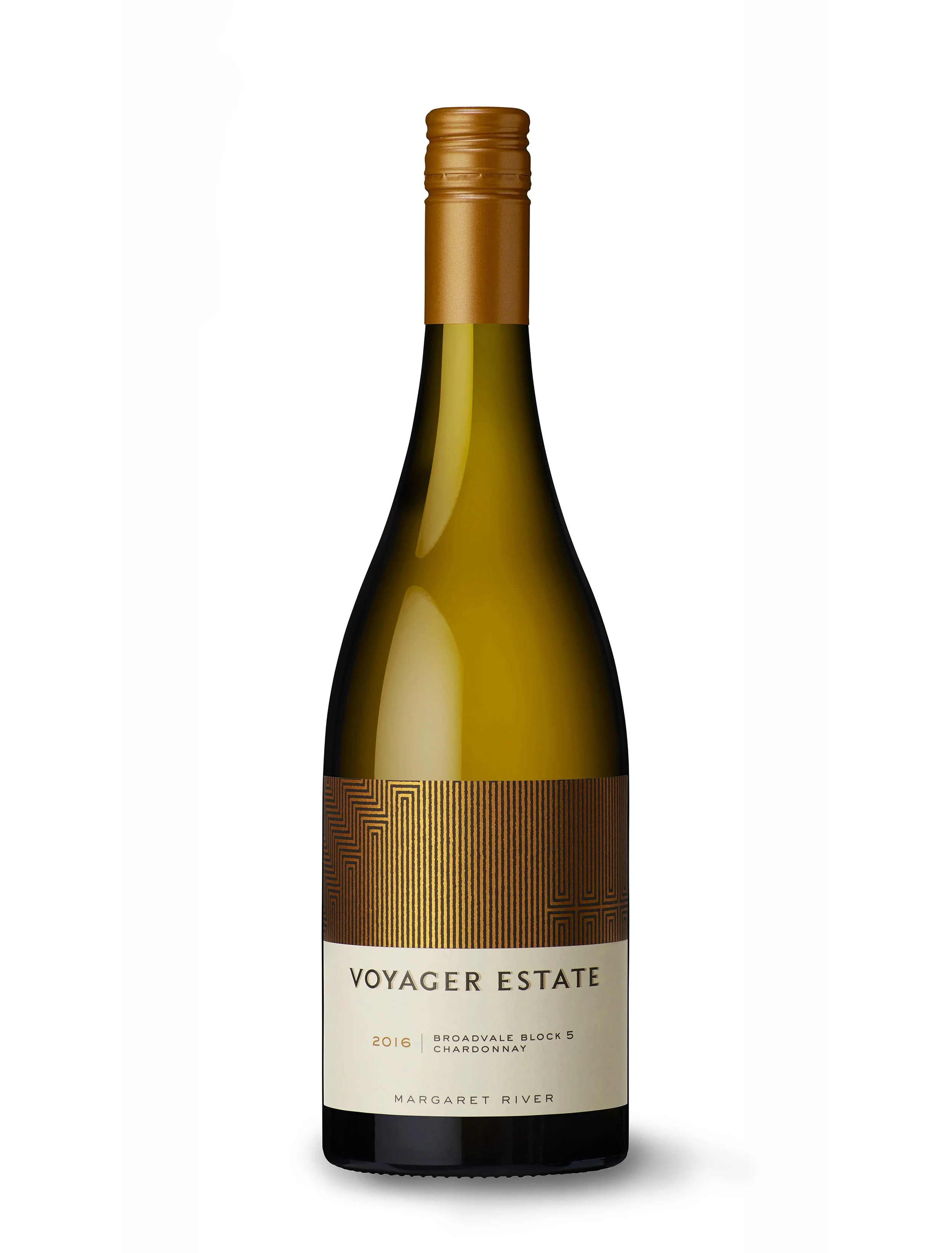
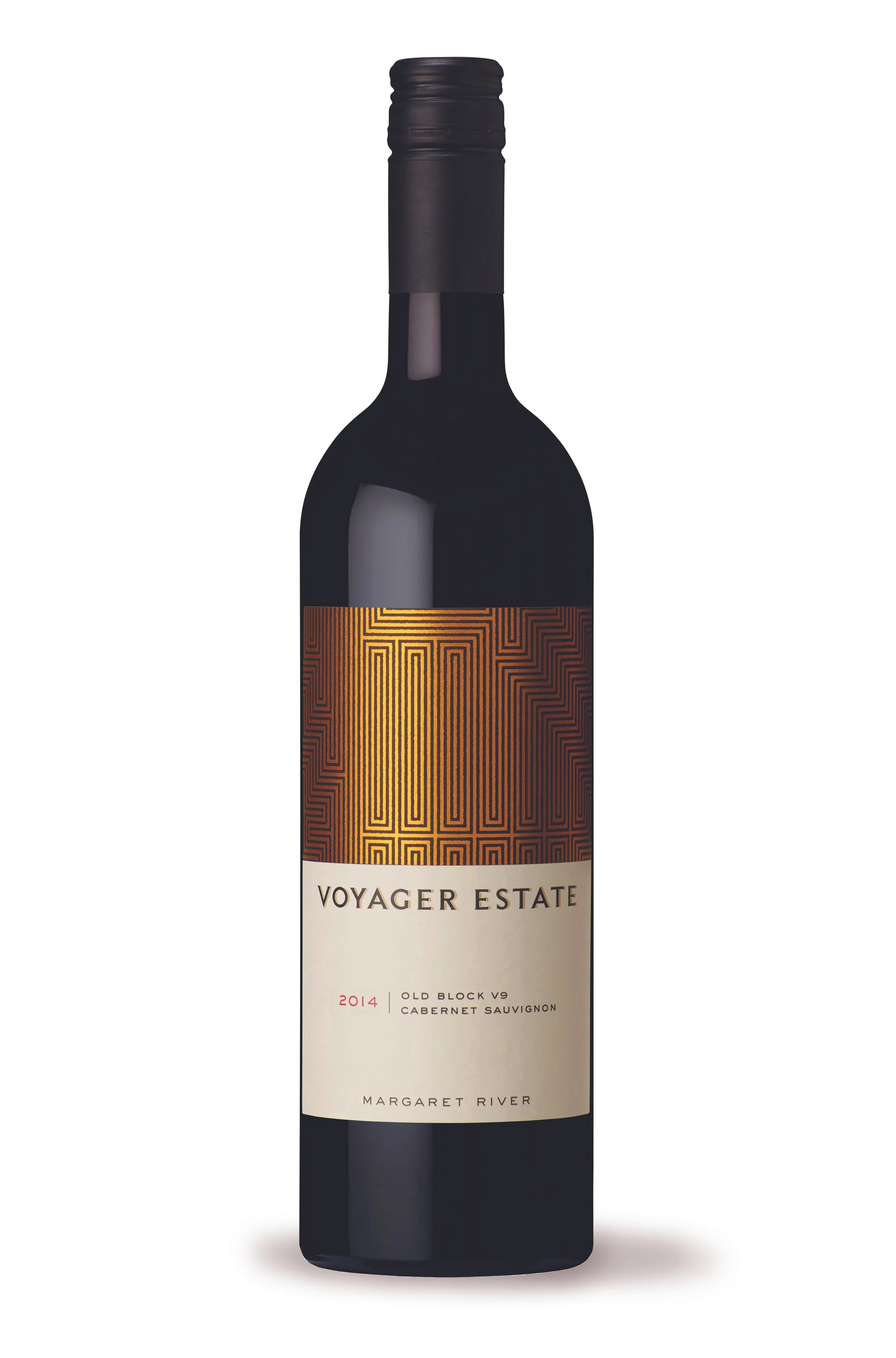
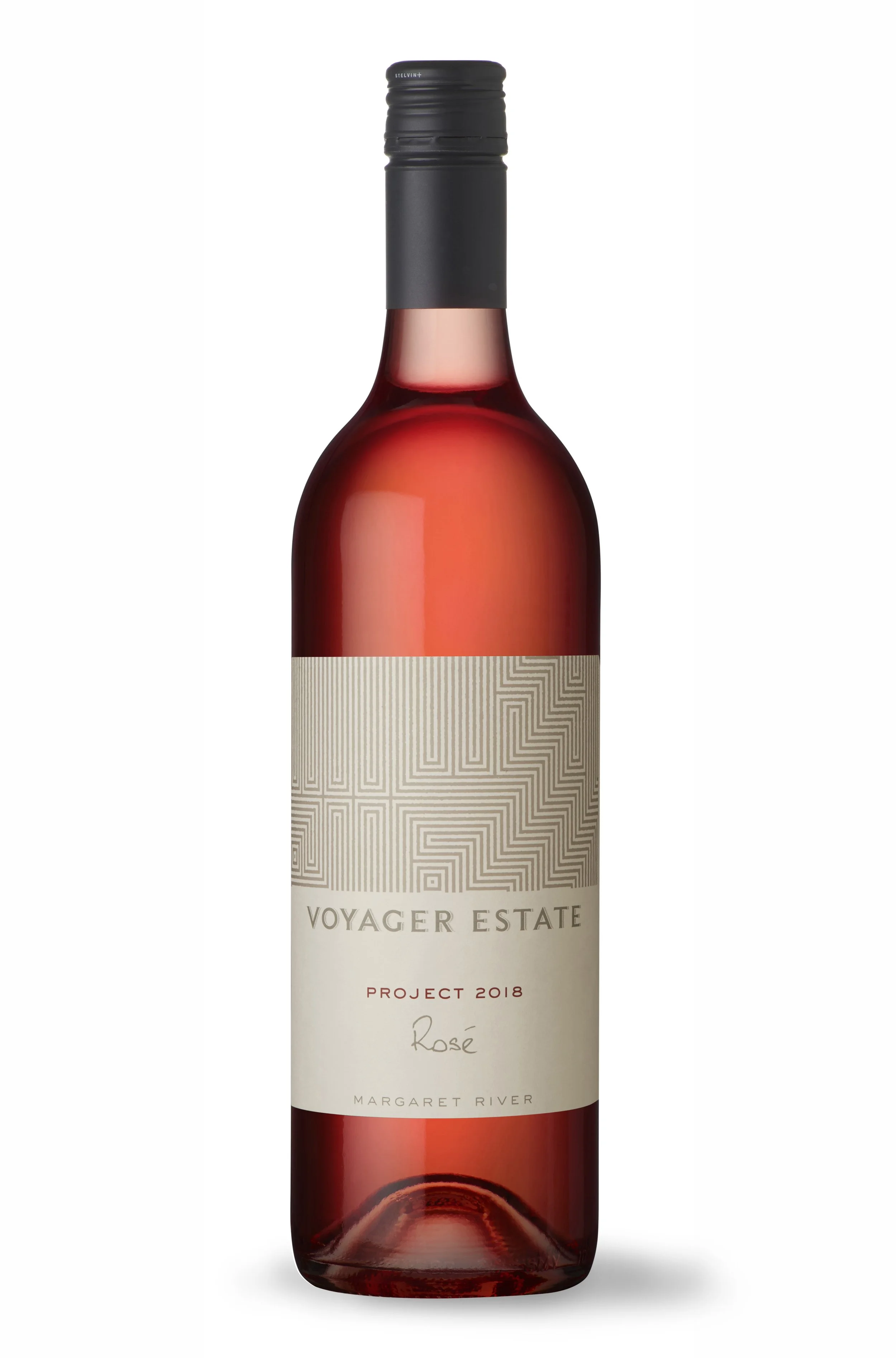
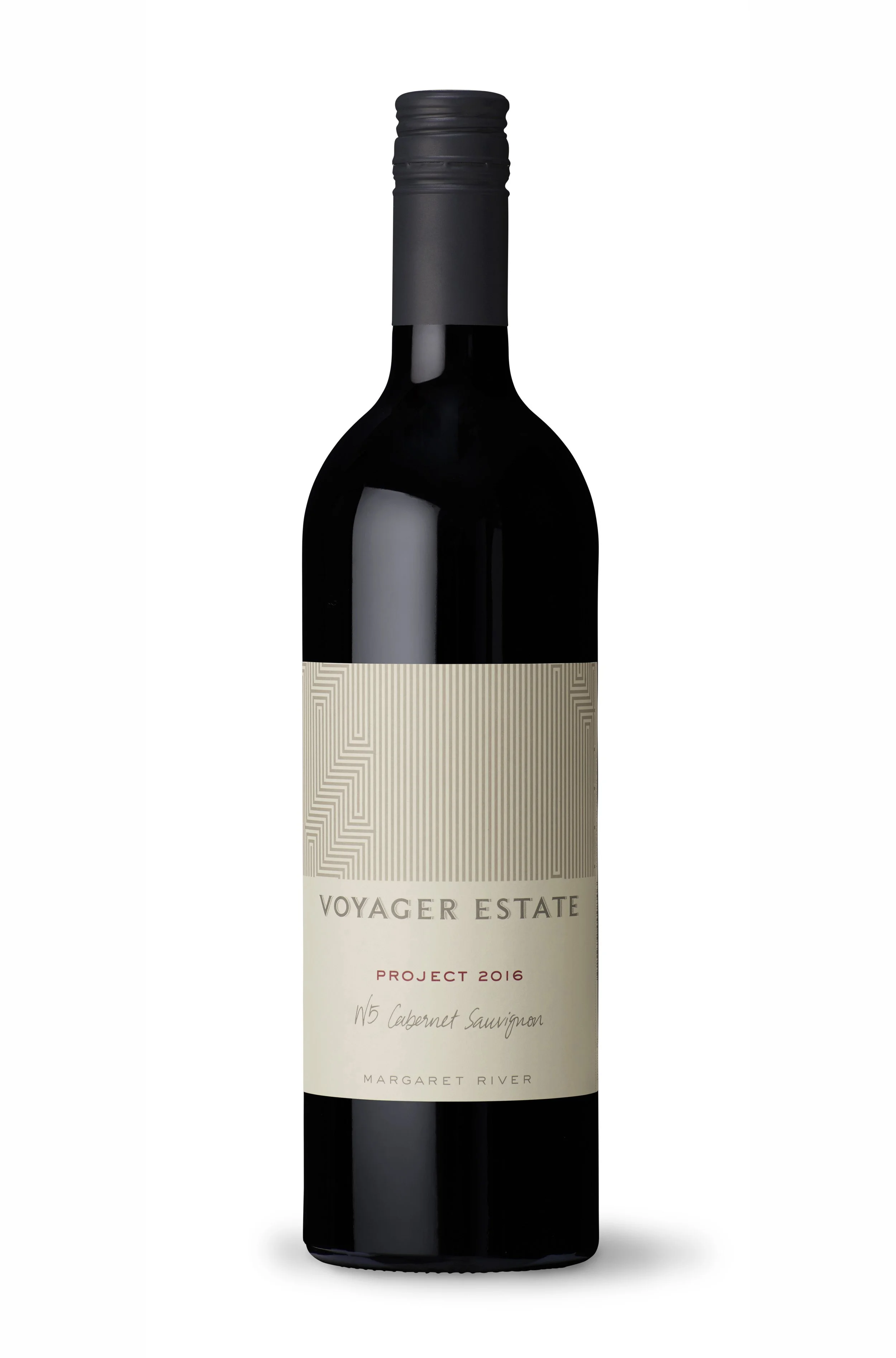
The top half of the Voyager Estate label is a pattern block unique to every wine they release.

Strictly speaking this isn’t actually a pattern but a slice of a topological map of the estate created to show vineyards, wetlands, roads and bushland in a simple stylised graphic.

The pattern on each label is lifted from the relevant map vineyard area to form a graphic description of the wines terrior. Every label is unique and very specifically places the wine within Voyager Estate.

Next
Next

Transperth CAT